Monday 27 April 2015

Tamara de Lempicka

Tamara de Lempicka was a Polish Art Deco painter who was born and originally named Maria Gorska. Tamara was majorly influenced by Cubism and is said to have become the leading figures of the Art Deco style within two continents. 

Due to the fact that she was born into a wealthy family she already had the upper hand within the industry and this allowed her to be seen by Hollywood stars as 'baroness with a brush', this also allowed her status to be recognised, giving her the opportunity to paint duchesses and grand dukes. This status also allowed her to also publicise her paintings within popular galleries which boosted interest within her works. 


Example of Tamara's work:

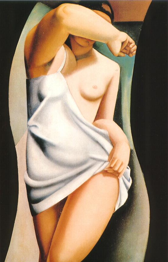
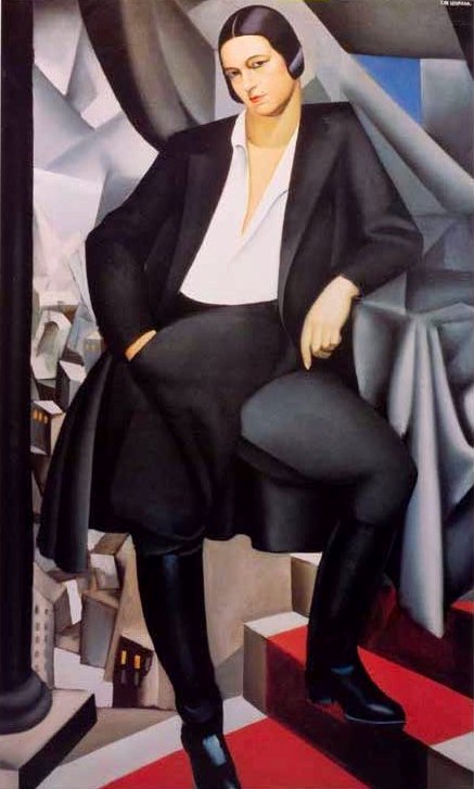
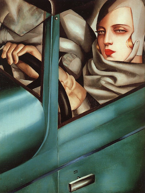
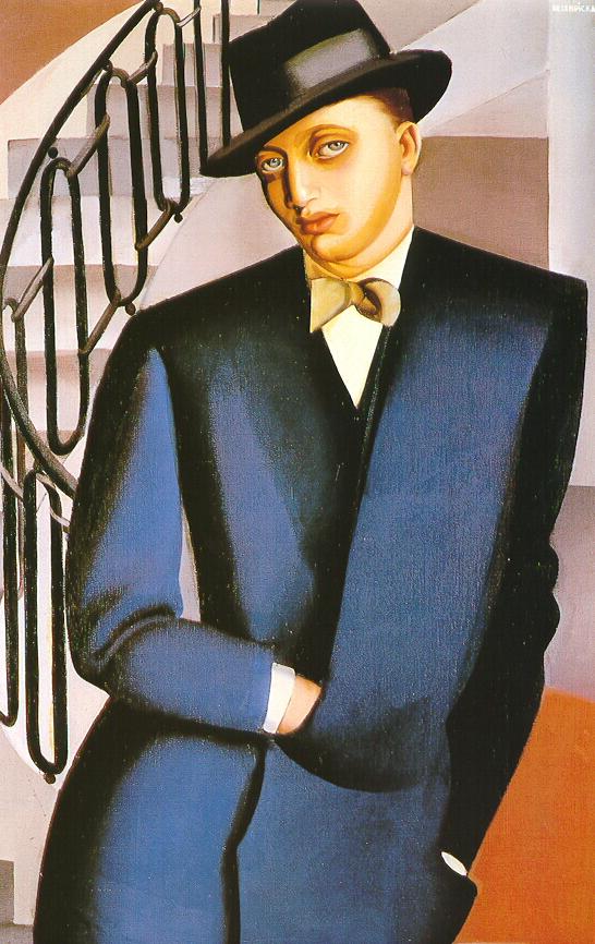
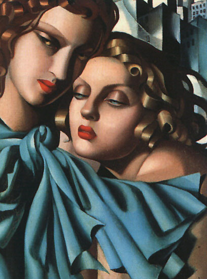
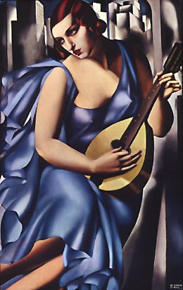
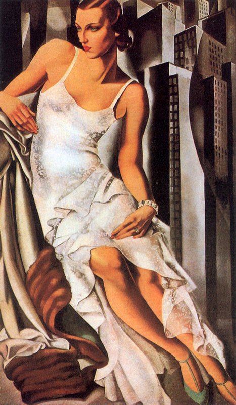
Tamara's style s distinctive due to the fact that her style is very bold. Her style developed quickly and is said to have been influenced by artists such as Andre Lhote and Maurice Denis. She is also said to have made Art Deco cool  because her style was sort of in the style of 'soft cubism'. her work clearly displayed an elegant and yet slightly erotic part of Art Deco and this was done with her precise technique. Within her career Tamara was able to meet people such as Pablo Picasso, Andre Gide, and Jean Cocteau. It is said that she was thought of to have a high sex drive and this was probably the reason she was a bisexual. Her search for sexual pleasure caused her to become closely associated with lesbian and bisexual women and this seemed to have caused a conflict within her marriage and this led to a divorce. Her neglect was said to not have been only towards her husband but towards her daughter too. Tamara produced a series of paintings of her daughter Kizette and the constant production of paintings which displayed her daughter affected her paintings as it is said that her other paintings of woman sometimes resembled Kizette. Tamara's first major exhibition was in Milan Italy and within this exhibition it is believed that she finished 28 new works in 6 months. Tamara is also said to have tried to change her style but due to the lack of interest from the public, she discontinued this. Tamara lived a complicated but successful life and with this, she died in her sleep with her daughter by her side and her ashes were spread on the top of the volcano Popocatepetl.
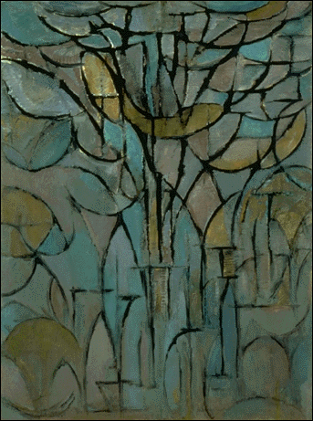
Monday 20 April 2015

Richard long

Richard long is one of the most well known British land artist and he's also known for being a sculptor. He was born in June 2, 1945. Long has achieved many great things for example, he is the only artist to have been shortlisted for the Turner Prize four times four times.

Long studied under artists such as Anthony Caro and Philip King and these artists were the two main artists who influenced Long. 

Example of Long's works:


Most of Long's works are quite revolutionary but Long's most famous piece called, 'A Line Made By Walking', is what really made his work something to have been looked at in more depth. This piece clearly displays a narrow line which was visible in the sunlight which had been created by him flattening the grass by walking back and forth. The line leads towards tall trees and bushes. This image was taken in a meadow near his home in Bristol. Richard long took it upon himself to make walking an art form so it is no surprise that he created this piece. Richard Long said, " A local could walk by and not notice it, or notice it and not know what anything about me. Or someone could come upon a circle and know it was a circle of mine, I really like the notion of visibility or invisibility of the work as well as the permanence and transience.", in my opinion this shows that he likes the fact that people can either be intrigued by his work or not care at all about his work and also the fact that his work can either last permanently where he created it or it can only last for a short period of time shows that he really just creates art within the moment or it could be at a particular place at a particular time. It seems to me that Richard Long, within his land works, also wanted to show to people that walking could also be a form of art and that man and nature could create a beautiful thing. 

Tuesday 14 April 2015

Keith Coventry

Keith Coventry is a British artist who was born on December 30, 1958. One of his greatest achievements was winning the £25,000 John Moores Painting Prize for his painting called 'Spectrum Jesus'.

Coventry made a series of paintings which were Estate Paintings. His Estate paintings are thought to be like homages to Kasimir Malevich's Suprematist paintings. These pieces usually consist of geometric shapes which are usually in a black or dark red colour.These geometric shapes represents the layout of buildings found outside British council estates. Out of all Estate paintings that Coventry has painted, Two of his paintings are in the Tate Gallery. Many of the estates that have been painted have either demolished or are scheduled to be demolished.

Estate Paintings:


Keith Coventry ‘East Street Estate’, 1994
© Keith CoventryKeith Coventry ‘Heygate Estate’, 1995
© Keith Coventry

Sunday 12 April 2015

Piet Mondrian

Piet Mondrian was a Dutch painter who was born on March 7, 1872 but died on February 1, 1994. Mondrian is said to have been a major contributor towards the art movement De Stijl. He took a non-representational form and evolved it, he then named it Neoplasticism which is another name for De Stijl. This consisted of a white background, which he then painted a grid of vertical and horizontal black lines and the three primary colours.

After World War I, Mondrian embraced the art of pure abstraction which whilst in doing so he created grid-based paintings. Over his years of trying to find his own style, his work evidently evolved. Within his early grid-based paintings, the lines which represented the separation lines or border are thin and grey. The lines also had a tendency to fade as they got towards the edge of the painting. the rectangles are also smaller and are larger in quantity, these rectangles are either primary colours, black or grey, next to all of the rectangles were coloured whilst only a few were left white.

 Later on into Mondrian s career, we see evidence of the evolution of his style and maturing of his painting as we see that the lines have gotten thicker, the rectangles are now fewer in quantity, and more of the rectangles are left white. Further into the years, Mondrian starts to use fewer  coloured rectangles and started to favour the use of white rectangles.

Mondrian is set to have used unexpected methods which would not be able to have been seen or else close observation is to be taken place. His grid-based paintings appear to have perfectly flat planes of colour which wasn't the case as it has been found out that he used subtle brush strokes throughout. The rectangles that have been painted using the primary colours have brush strokes all going in one direction, the black lines contain the least amount of depth, and the white rectangles were painted in layers which were painted using brush strokes which went in different directions. 

Mondrian started to experiment as he started to use more lines which were arranged in an overlapping arrangement. His experimental faze as later on he then decided to use thick, coloured lines instead of using black lines. It seemed as though he embraced the art form as this is evident in his later work such as later he carried on to create pieces such as 'Composition' and ' Place de le Concorde'. 


Mondrian started to show evidence of a new expression within his work as he started to place his canvas in a different position. Mondrian's painting called 'Broadway Boogie-Woogie is said to have been a major influence towards abstract geometric painting. Mondrian the went ahead to create a piece called 'Victory Boogie Woogie' which  is said to have been more revolutionary than evolutionary. The Victory Boogie Woogie is also said to have been the most profound development within his work. 


Mondrian's 'tree' abstract art development:

Avond (Evening); Red Tree by Piet Mondrian
Gray Tree by Piet Mondrian
Trees by Piet Mondrian
Tableau No. 2 Composition No

Obviously Mondrian didn't start off painting squares, I started off talking about  his development and evolution within his famous De Stijl paintings due to the fact that he was most famous for that, Mondrian grew up within a period where Impressionism and Post-impressionism were flourishing so his early works displayed clearly some characteristics of these styles. As Mondrian continued to paint, his later works showed signs of incorporating other artists' styles within  his work such as Braque and Picasso. 

Within Mondrian's exploration of nature, we can see clearly within the images above that Mondrian developed his style by simplifying and abstracting the forms he saw. Whilst Cubism began to become more popular, we see that Mondrian tries to adapt this art form within his art work as this allowed him to break down the objects he saw in front of him into their most basic forms as he translated them onto his canvas. Within the second picture above which displays one of his abstract tree paintings, we can see that he has started to create black outlines which create faint rectangles at the bottom of the painting. Within the third image you can see that his interest in dark outlines and geometric shapes has started to form. Further development within Mondrian's search for his own style within the fourth image as we clearly see the presence of more vertical and horizontal lines, diagonal and curve lines are sometimes seen but hardly used. Within the fourth picture we see that Mondrian's style of abstraction was on such a different level that we can now say that he has more or less departed from that style. Mondrian moved from abstract to painting his grid-based pieces which made him so well due to the fact that he was the only artist that in a way found the purest form of abstract art which was what he was searching for.


Wednesday 8 April 2015

A.M. Cassandre

Cassandre was a Ukrainian-French typeface designer, painter, and commercial poster artist. He was born on January 24, 1901 but died on June 17, 1968. Cassandre was inspired by art movements such as Cubism and Surrealism. His best work is said to have been the posters that were used to advertise travelling.

Cassandre, in his time, created typography which was well known such as the sans serif and Peignot. With the unpleasant beginning of World War II he has to partake by serving in within the French army. Whilst serving the French army he created stage sets and costumes for the theatre. When the war ended Cassandre continued within those areas and whilst doing so he also created the famous Yves Saint Laurent logo.

Examples of Cassandre's work:


Nord Express Transatlantic Cruise Ship Dubonnet Poster 1932

Cassandre's works display a fusion of Art Neouveau's curves and the geometric abstraction of 'Cubism' and 'Futurism'. Cassandre's portray the luxurious lifestyle that was present within his time, for example, the transport. In order to create his masterpieces, Cassandre used stencils and airbrush to produce his stylized images. Although his style was a fusion of styles, Cassandre's style was typically Art Deco. Cassandre believed that "Designing a poster means solving a technical and commercial problem....in a language that can be understood by the common man.", in my opinion I think that he meant that when designing a poster, one should try and take a complicated problem and design it into a simplistic form that anyone can understand whilst trying for the message within the poster to not lose value. I like the way Cassandre integrates his typography within his posters because it doesn't allow the eye of the audience to sway away from the poster, so who ever is looking at the poster doesn't have to feel like they either have to look at the text or the image.


Tuesday 7 April 2015

Bauhaus

Bauhaus was one of the first art and design schools that was around was established in Germany by an architects called Walter Gropius in 1919. Bauhaus combined crafts, fine arts. It also had a major influence on developments in art, architecture, graphic design, interior design, industrial design, and typography. Bauhaus was suppose to be a combined architecture school, crafts school, and academy of the arts.

The school is said to have taught new media which allowed students to experiment more with materials such as wood, metal, glass, plastics, and other materials that gave everything and anything a futuristic look.

Bauhaus  had a major influence on art and architecture within areas such as Western Europe, the United States, Canada, and Israel in the after its demise, due to the fact that many of the artist were either exiled or fled from the Nazi regime.

What is said to have been one of the most important contributions from Bauhaus was within the field of modern furniture design. 

Although the school was only open for 14 years, the movement clearly made a huge impact as elements are still being used from it such as white space and clean lines.

Also, some people think that Bauhaus was a formal group, it was a school which was directed by three architects which were Walter Gropius, Hannes Meyer, and Ludwig Mies van der Rohe. 

Art Deco

Art Deco was a visual arts design style which was very influential when it first emerged during World War I in France. The style didn't begin to flourish until the 1920s-1940s and then its popularity started to deteriorate after World War II. Art Deco is a combination of styles which are the traditional craft motifs with Machine Age imagery and materials. 

Characteristics of the style includes:
  • Rich colours
  • Bold geometric shapes
  • Lavish ornamentation
Due to the fact that Art Deco emerged after World War I, we then know that the style emerged from the interwar period which was a period of time where technology and rapid industrialisation were transforming the society and culture of the time. At that time, buildings were getting higher, modes of transport such as trains and cars were getting faster, and glamorous and luxurious products were being more demanded which made mass production huge.

Artist such as Hector Guimard, Eugene Grasset, Raoul Lachenal, and Paul Bellot are said to have been to be some of the first people to have influenced the principals of Art Deco. Art Deco includes elements of art such as curves, geometric shapes, vertical lines, symmetry, simplified forms, zigzags, 'sun rays', and the new technique called airbrushing which is combined with the rich colours used within the style. Art Deco was also influenced by Cubism, Constructivism, Functionalism, Modernism, and Futurism. 

Art Deco affected various aspects of design. It was immensely in consumer products such as furniture, textiles, automobiles, jewellery, china, cookware, clocks, and electronic devices such as telephones, jukeboxes, and radios. Art Deco also influenced interior design, architecture, industrial design, graphic arts, fashion, and cinema. 

It seems as though Art Deco might be making an entry once again. The film 'The Great Gatsby' is the most influenced film out. The film is based on life during those days; the set design, poster, music, and poster captured the Art Deco concept that was being portrayed during the time perfectly. 


Monday 6 April 2015

Aubrey Beardsley

Aubrey Beardsley was an English author but was Renowned for being a great illustrator. He was born on August 21, 1872 but died on March 16 1898. Although Beardsley was a leading figure in the Aesthetic movement, he also played a major role in the development of Art Nouveau although he lived a very  short 25 years.

The major influences in Beardsley's career and style were Henri de Toulouse-Lautrec and the Parisian fashion for Japanese print. Most of his pieces are made using ink and feature large dark areas contrasted with large blank ones, and areas containing fine detail within areas with none at all. 

Beardsley's controversy within the Art Nouveau era is clearly evident within his work which usually displays dark,  erotic, and perverse images. His works were usually black and white, against a white background. The image of the left (like some of his drawings) is inspired by the Japanese Shunga artwork and it displays enormous genitalia.

Not only did he create artworks for himself, he also produce illustrations for books and magazines. Beardsley said, "I have one aim-the grotesque. If I am not grotesque", this showed that he took pride in his artwork and it showed that he felt that his grotesque style was what made him the man he was. 


Examples of Aubrey Beardsley's work:


Alphonse Mucha

Alphonse Mucha was a decorative artist and Art Nouveau painter who was best known for his distinct style. Mucha was born on July 24, 1860 but sadly died on July 14, 1939. Many of Mucha's works consisted of illustrations, postcards, designs, advertisements, and paintings. 

Mucha was one of the pioneers of Art Nouveau as during the late 1890's he created a vast number of posters, advertisements, and paintings, as well as designs for carpets, wallpapers, jewellery, and theatre sets.

Some of Alphonse Mucha's pieces:


I like Mucha's pieces because of his use of beautiful women to, for example, advertise whatever product was being advertised. One of Mucha's most successful posters was for a cigarette rolling paper company called 'JOB'; this piece was just one of a couple of posters Mucha created for JOB. This JOB poster (image on the left) displays the use of gold, green, and blue together with orange and purple were used within this poster in order to catch the eye of the audience and this was effective as this poster was used to advertise rolling papers. The fact that the woman is in an almost sexual position shows that she is enjoying the product a lot and it would make the audience feel that they would want to feel the way the woman in the poster feels.

Most of Mucha's works display beautiful women, curves, some sort of floral design or pattern, and or many other things you would usually find within Art Nouveau. I really like Alphonse Mucha's pieces.